The saying, 'a picture is worth a thousand words,' couldn't be more relevant for websites. When used properly, images are always more effective than text at expressing a concept or communicating with today's picture and video-hungry website surfers.
The Bigger, the Better
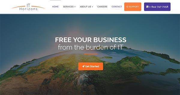
For 2015, photos are as important as ever to web design. In particular, some of the best website designs this year will use those huge background images that are being used increasingly for everything from e-commerce stores to not-for-profit organization sites and beyond. Using a single, high quality image as the background for a web page is a great way to make a statement. Huge background images are not only visually-attractive and offer a very clean looking website design, but they can also set the tone for a company's branding much more effectively than text ever could. Remember, our brains process images much faster than words.
Blocky Card Design
Another trend that doesn't look like it will be fading anytime soon is the use of blocky card or tile design. When you consider just how effectively the social media giant, Pinterest, has used this style of presenting images, it isn't hard to believe that some of the best website designs this year will employ the same technique to create a unique look that's also interactive.
What makes card design so cool? It's a way to break up the page with interesting, interactive images, keeping the site design clean but without losing too much of the substance that your visitors need to really feel engaged. What's more is that card design is particularly well-suited for responsive design, which is a must for any online presence today.
Parallax is Where it's At
Just like the super cool ways that video and animation are being subtly incorporated into web design, HTML 5 has made it possible to create some other really unique effects using images with what's referred to as Parallax Illusion. To put it simply, when you scroll on a website where Parallax has been incorporated into the design, the background will move more slowly than the content and images that are in the foreground. The effect is often nothing short of awesome, as images appear to jump off the page. While a web design that overuses this technique can have the opposite effect, Parallax can be used to create very memorable web pages.
If it's time to breathe a little life into your existing website, or you're in need of a high performing and visually memorable online presence, call us to discover some of the ways that these and other trends can be utilized to create the best website designs for your brand: (780) 539-7258.

We live, work, and gather on traditional, unceded, and treaty territories of First Nations, Métis, and Inuit Peoples from coast to coast to coast. We’re committed to our collective responsibility to the original caretakers of this land and to listening, learning, and acting in ways that support reconciliation.